Merito - Rebrading & UI Design
Overview
Merito is an EdTech platform that required a strategic rebrand to improve trust, clarity, and consistency across its digital presence. The objective was to realign the brand identity and website experience to create a more credible and seamless learning journey for students.
My Approach
Brand Color & Identity Reset
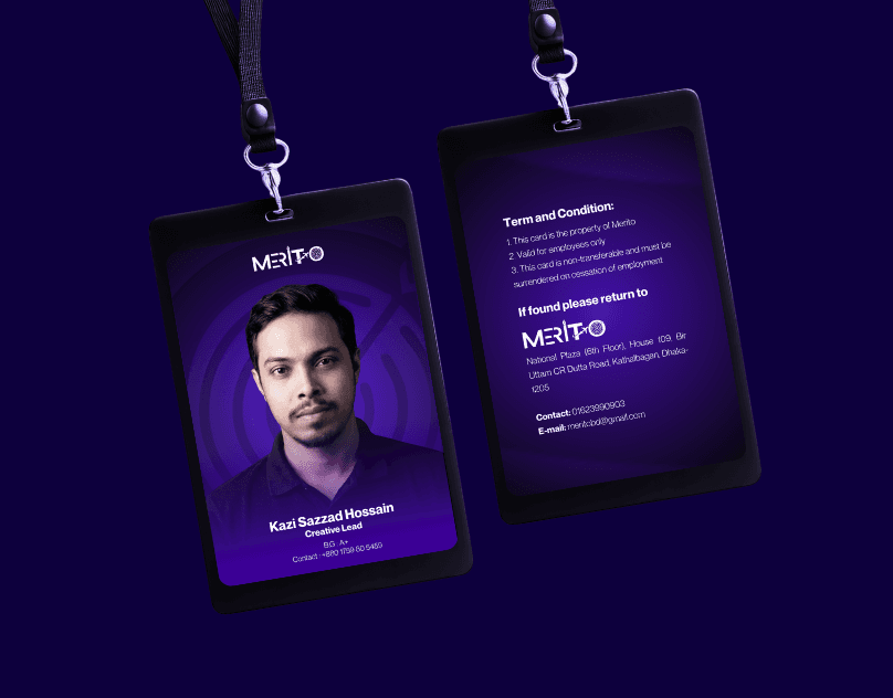
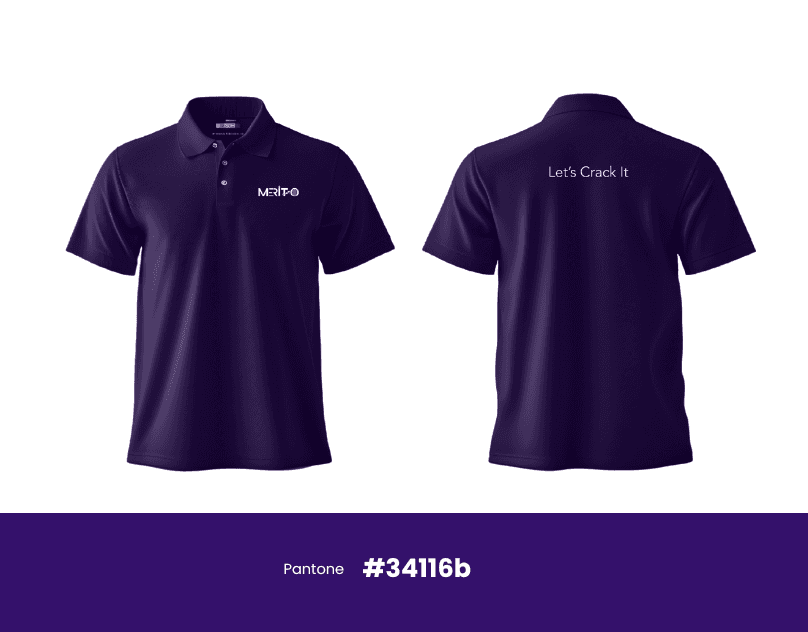
I shifted the primary brand color from green to purple to position Merito as a more credible, modern, and premium EdTech brand. Purple was chosen to communicate trust, creativity, and academic depth, helping the brand stand out while reinforcing confidence among students and parents.
 |
|---|
 |  |
|---|
Social Media Rebranding
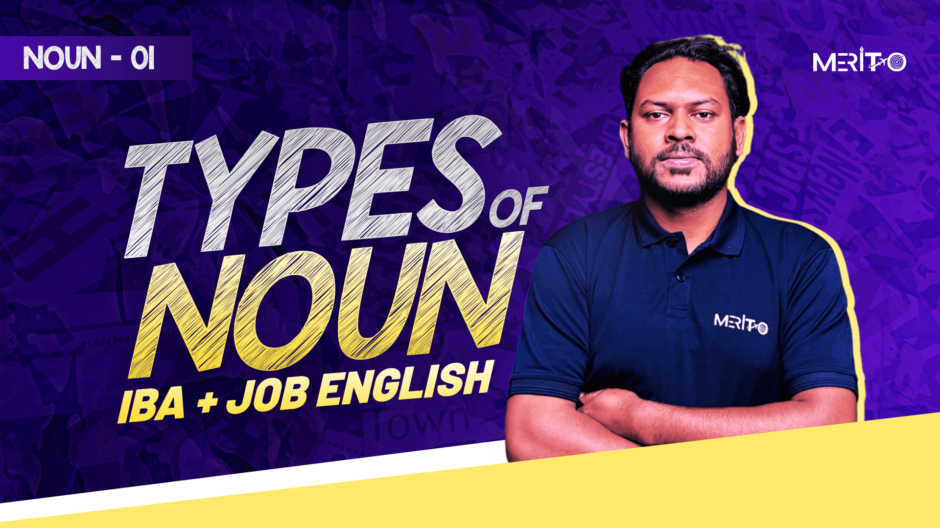
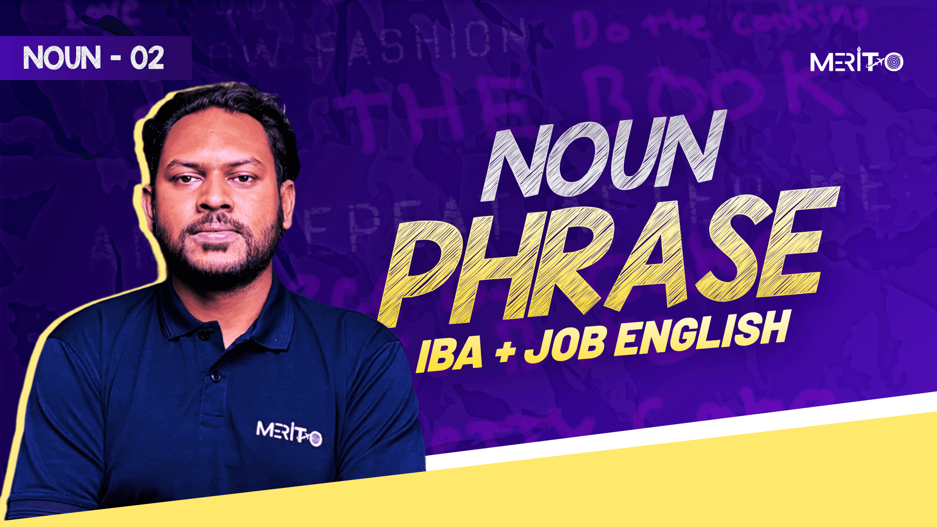
I redesigned Merito’s social media visual system to align with the new brand identity, introducing consistent layouts, typography, and content hierarchy. This ensured stronger brand recall, visual consistency, and a unified tone across all platforms.
 |  |  |
|---|
 |  |  |
|---|
Youtube Thumbnail |
|---|
 |  |
 |  |
Website UI & User Flow Redesign
Finally, I redesigned the website UI and user flow to reflect the new brand positioning—improving navigation, visual hierarchy, and trust signals to deliver a smoother, more intuitive, and confidence-building online learning experience.
Click to view the full UI project on figma : https://www.figma.com/design/xwd5m8WnHnzH9TzPnjxSFt/Merito-UI?node-id=0-1&t=v5a3Fot93ku9F7Qc-1 |
|---|